|
|
Logo of "Ecoproject"
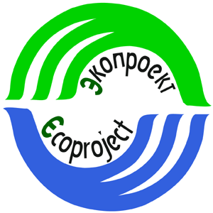
Logo of the organisation has a round shape and consists of two half-circles
with the name of the organisation in Russian and English language.
Idea behind the Logo reflects in full organisation's founding goals, as well as the theme
of Sustainable Development, which is defined as "development that meets the needs of present generation
without compromising the ability of future generations to meet their needs". In other words,
during his/her lifetime every person has to take care of the legacy, that will be left to the descendants -
unexhausted natural resources, healthy environment, possibility to live
fulfilling lives. Our Logo underlines the direction of our work, as we are the Initiative in the field of
Sustainable Development.

Additionally, the Logo is designed in harmony with the official symbolics of the
World Summit on Sustainable Development 2002 in Johannesburg - the most important event after Rio 1992 for all
those trying to find a balance between the healthy environment, economic development and social/human issues.
Round
shape of the "Ecoproject" Logo symbolises marurity, integrity,
balance, and resembles the globe - our planet Earth. Top and bottom parts of the Logo
- these are 2 "palms", symbolising care of the environment and the planet. Three branches on every palm symbolise the team of initiators and
founders of the organisation (3 persons - Tatiana Dereviago, Polina Pimenova and Yulia Yablonskaia). In addition, 3 branches also reflect
a triple bottom line of the sustainability "economy - environment - social sphere", or "people - planet - prosperity".
Green and blue colours - colours of the nature (water and green plants) - reflect environmental direction of the organisation.
Author
of the Logo - Polina Pimenova, "Ecoproject"
|
